Contact our expert team

Questions or service requests? Reach out for fast, professional support on memberships or repairs.

Thank you! We’ll be in touch soon.
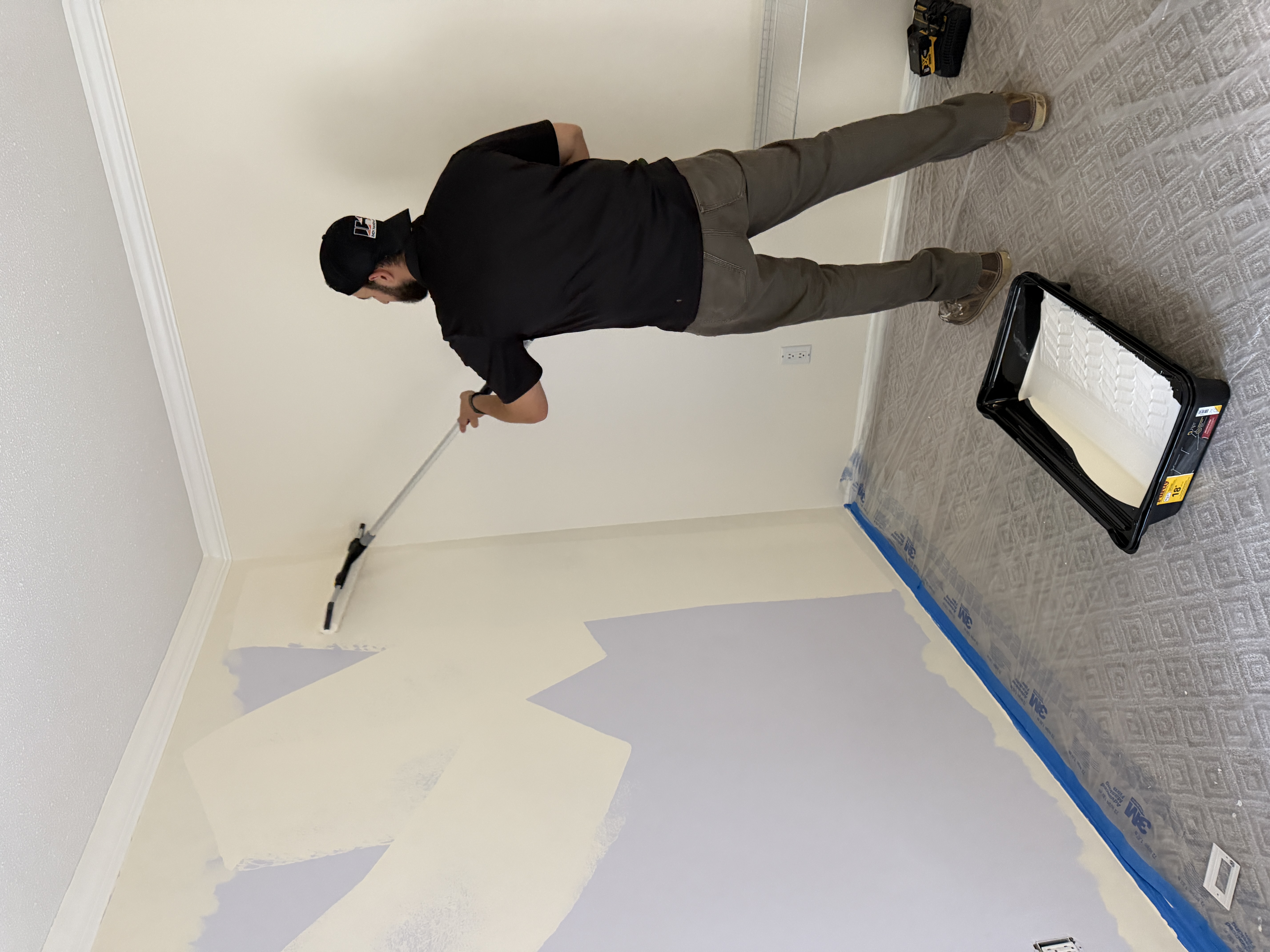
image of contractor on rooftop
Submission failed. Please review your details.

Home care FAQs, answered fast

Essential info for homeowners and clients

Still have questions? We’re here to help.

Premium support, every step covered

Contact us for expert help, fast responses, and seamless service—membership and one-time requests welcome.

Expert help, zero wait time

Call, email, or message for prompt answers and professional assistance with any home project.

Contact options that fit your needs

Reach us by phone, form, or email. We respond quickly and keep it simple.

image of contractor on rooftop

Tailored assistance for every request

Get support for memberships, service inquiries, or custom projects—our team is ready to help.

[background image] image of a bike workshop (for a bicycle shop)

Expert help, zero wait time

Call, email, or message for prompt answers and professional assistance with any home project.

Foundations

This style guide is a collection of elements and components with brand colors and typography applied. To change any colors or values use Variables (V) panel.

Built with:
Flowkit is a Webflow's utility-first CSS framework that helps you build websites quickly by applying pre-made CSS in Webflow.

Color

Foundation colors is a set of variables that should be applied to elements classes. Update colors by selecting an element (style panel) or in the variables panel

Core Colors
Accent Primary
Hover
Accent Secondary
Hover
Accent Tertiary
Hover
Neutral Primary
Secondary
Neutral Inverse

Background color

Section classes and background utility classes are using variables to adjust background and font color of nested text elements.

Primary (Default)

Heading

Well-crafted paragraph text is more than just a collection of letters
Secondary

Heading

Well-crafted paragraph text is more than just a collection of letters
Accent Primary

Heading

Well-crafted paragraph text is more than just a collection of letters
Accent Secondary

Heading

Well-crafted paragraph text is more than just a collection of letters
Accent Tertiary

Heading

Well-crafted paragraph text is more than just a collection of letters
Inverse

Heading

Well-crafted paragraph text is more than just a collection of letters

Typography

Headings tags and classes are connected through the variables which helps to keep them consistent.

Read docs

Headings

Title
Preview
Heading hero

Voice of a brand

Heading primary

Headings embody the voice of a brand

Heading secondary

Headings embody the voice of a brand

Heading tertiary

Headings embody the voice of a brand

Heading small

Headings embody the voice of a brand

Heading xsmall
Headings embody the voice of a brand
Heading xxsmall
Headings embody the voice of a brand
Semantic tags
Title
Preview
All H1 headings

Headings embody the voice of a brand

All H2 headings

Headings embody the voice of a brand

All H3 headings

Headings embody the voice of a brand

All H4 headings

Headings embody the voice of a brand

All H5 headings
Headings embody the voice of a brand
All H6 headings
Headings embody the voice of a brand
Paragraph
Title
Preview
Paragraph xxlarge

A well-crafted typeface is more than just a collection of letters— it is the fingerprint of great design, carrying within it the essence of a brand, a message, and a mood.

Paragraph xlarge

A well-crafted typeface is more than just a collection of letters — it is the fingerprint of great design, carrying within it the essence of a brand, a message, and a mood.

Paragraph large

A well-crafted typeface is more than just a collection of letters — it is the fingerprint of great design, carrying within it the essence of a brand, a message, and a mood.

Paragraph (Default)

A well-crafted typeface is more than just a collection of letters—it is the fingerprint of great design, carrying within it the essence of a brand, a message, and a mood.

Paragraph small

A well-crafted typeface is more than just a collection of letters—it is the fingerprint of great design, carrying within it the essence of a brand, a message, and a mood.

Other text elements
Title
Preview
Subheading
A well-crafted typeface is more than just a collection of letters—it is the fingerprint of great design, carrying within it the essence of a brand, a message, and a mood.
Quote
Never before have so many people had so much access to such a powerful medium for building businesses; sharing knowledge, insight, and creativity; and creating communities.
Eyebrow
Adventure Awaits
List unordered
  • Use white space to improve text legibility.
  • Make typography responsive for all screen sizes.
  • Use proper line spacing for easy readability.
List ordered
  1. Use white space to improve text legibility.
  2. Make typography responsive for all screen sizes.
  3. Use proper line spacing for easy readability.

Spacing

Spacing styles such as margins, paddings, and gaps are using predefined set of REM-based variables and applied directly to component classes.

Read docs
Gap

Set of variables used for grid and flex layouts.
Read docs for more information.

Variable
Preview
XXS Gap
XS Gap
SM Gap
MD Gap
LG Gap
XL Gap
XXL Gap
Spacing

To keep spacing consistent, most of the text elements and components have spacing applied as margin or padding.

Preview
Adventure Awaits

Headings embody the voice of a brand

A well-crafted typeface is more than just a collection of letters—it is the fingerprint of great design, carrying within it the essence of a brand, a message, and a mood.

Components

Buttons

Every type of buttons have 2 properties: color and size.

Read docs

Text Button

Primary
Small Secondary
On Accent Primary
On Accent Secondary
On Accent Tertiary

Link

Primary Link
Small Secondary Link
On Accent Primary
On Accent Secondary
On Accent Tertiary

Tags

Every type of tags have 2 properties: color and size.

Read docs
Primary
Tag Label
Inerse
Tag Label
On Inverse
Tag Label
On Accent Primary
Tag Label
On Accent Secondary
Tag Label
On Accent Tertiary
Tag Label
Images

Images are wrapped into a div with a class ratio_(value) It helps to control an aspect ratio of the image, takes care of overflow behavior and has a radius applied.

Read docs
Ratio 16:9
Ratio 3:2
Ratio 4:3
Ratio 1:1
Ratio 3:4
Ratio 2:3
Avatar

Avatar size can be adjusted with combo classes.

Read docs
Small
Medium
Large

Icons

Icons size can be adjusted with combo classes.

Read docs
Extra Small
Small
Default
Large
Extra Large
Default
On Inverse
On Accent Primary
On Accent Secondary
On Accent Tertiary

Forms

All the form elements are adopting to the different surfaces.

Read docs
On Primary Color
Thank you! Your submission has been received!
Oops! Something went wrong while submitting the form.
On Inverse Color
Thank you! Your submission has been received!
Oops! Something went wrong while submitting the form.
On accent
Thank you! Your submission has been received!
Oops! Something went wrong while submitting the form.
On accent secondary
Thank you! Your submission has been received!
Oops! Something went wrong while submitting the form.
On accent tertiary
Thank you! Your submission has been received!
Oops! Something went wrong while submitting the form.

Cards

All the cards and their elements are adopting to the different surfaces.

Read docs
Default Card

A different heading, so it doesn't look repetitive.

Read post
Secondary Card

A different heading, so it doesn't look repetitive.

Read post
Inverse Card

A different heading, so it doesn't look repetitive.

Read post
Accent Primary

A different heading, so it doesn't look repetitive.

Read post
Accent Secondary

A different heading, so it doesn't look repetitive.

Read post
Accent Tertiary

A different heading, so it doesn't look repetitive.

Read post
On Secondary

A different heading, so it doesn't look repetitive.

Aenean faucibus nibh et justo cursus id rutrum lorem imperdiet. Nunc ut sem vitae risus tristique posuere.

A different heading, so it doesn't look repetitive.

Aenean faucibus nibh et justo cursus id rutrum lorem imperdiet. Nunc ut sem vitae risus tristique posuere.

A different heading, so it doesn't look repetitive.

Aenean faucibus nibh et justo cursus id rutrum lorem imperdiet. Nunc ut sem vitae risus tristique posuere.

On Inverse

A different heading, so it doesn't look repetitive.

Aenean faucibus nibh et justo cursus id rutrum lorem imperdiet. Nunc ut sem vitae risus tristique posuere.

A different heading, so it doesn't look repetitive.

Aenean faucibus nibh et justo cursus id rutrum lorem imperdiet. Nunc ut sem vitae risus tristique posuere.

A different heading, so it doesn't look repetitive.

Aenean faucibus nibh et justo cursus id rutrum lorem imperdiet. Nunc ut sem vitae risus tristique posuere.

On Accent Primary

A different heading, so it doesn't look repetitive.

Aenean faucibus nibh et justo cursus id rutrum lorem imperdiet. Nunc ut sem vitae risus tristique posuere.

A different heading, so it doesn't look repetitive.

Aenean faucibus nibh et justo cursus id rutrum lorem imperdiet. Nunc ut sem vitae risus tristique posuere.

A different heading, so it doesn't look repetitive.

Aenean faucibus nibh et justo cursus id rutrum lorem imperdiet. Nunc ut sem vitae risus tristique posuere.

On Accent Secondary

A different heading, so it doesn't look repetitive.

Aenean faucibus nibh et justo cursus id rutrum lorem imperdiet. Nunc ut sem vitae risus tristique posuere.

A different heading, so it doesn't look repetitive.

Aenean faucibus nibh et justo cursus id rutrum lorem imperdiet. Nunc ut sem vitae risus tristique posuere.

A different heading, so it doesn't look repetitive.

Aenean faucibus nibh et justo cursus id rutrum lorem imperdiet. Nunc ut sem vitae risus tristique posuere.

On Accent Tertiary

A different heading, so it doesn't look repetitive.

Aenean faucibus nibh et justo cursus id rutrum lorem imperdiet. Nunc ut sem vitae risus tristique posuere.

A different heading, so it doesn't look repetitive.

Aenean faucibus nibh et justo cursus id rutrum lorem imperdiet. Nunc ut sem vitae risus tristique posuere.

A different heading, so it doesn't look repetitive.

Aenean faucibus nibh et justo cursus id rutrum lorem imperdiet. Nunc ut sem vitae risus tristique posuere.

Tabs

Each tab button uses a base class and can be styled to reflect different backgrounds or interface variants.

Read docs
On Primary
This is some text inside of a tab block.
Tab Underline Style
This is some text inside of a tab block.
On Inverse
This is some text inside of a tab block.
On Accent Primary
This is some text inside of a tab block.
On Accent Secondary
This is some text inside of a tab block.
On Accent Tertiary
This is some text inside of a tab block.

Slider

Sliders use arrows for navigation. These arrows are styled using a base class, and surface modifiers can be added to adapt to different backgrounds.

Read docs
Default
Inverse

Accordion

The accordion component is used to toggle the visibility of content in a vertically stacked format.

Read docs
Title
Preview
Accordion
Accordion Label
Accordion Label
Accordion Label
Accordion opened
Accordion Label

Dropdown

The dropdown component is used to display a list of options that appear on interaction.

Read docs
Title
Preview
Dropdown

Rich Text

The Rich Text component is used for long-form content such as blog posts, CMS fields, or documentation. It ensures consistent formatting of text elements like headings, paragraphs, links, and lists.

Read docs
Preview

Heading 1

Heading 2

Heading 3

Heading 4

Heading 5
Heading 6

The rich text element allows you to create and format headings, paragraphs, blockquotes, images, and video all in one place instead of having to add and format them individually. Just double-click and easily create content.

  1. A rich text element can be used with static or dynamic content.
  2. The rich text element allows you to create and format elements
A rich text element can be used with static or dynamic content. For static content, just drop it into any page and begin editing. For dynamic content, add a rich text field to any collection and then connect a rich text element to that field in the settings panel. Voila!


Divider

Dividers have two types: horizontal and vertical

Read docs
Horizontal Primary
Horizontal Secondary
Horizontal Accent
Vertical Primary
Vertical Secondary
Vertical Accent

Headings embody the voice of a brand

Headings embody the voice of a brand

Headings embody the voice of a brand

Headings embody the voice of a brand

Headings embody the voice of a brand

Headings embody the voice of a brand
Headings
Headings
Headings
Aa
This is some text inside of a div block.
Aa
Aa
Aa
Aa
Aa
This is some text inside of a div block.
Your site should do more than look good
This is some text inside of a div block.
label
Block Quote

Heading 1

Heading 2

Heading 3

Heading 4

Heading 5
Heading 6

The rich text element allows you to create and format headings, paragraphs, blockquotes, images, and video all in one place instead of having to add and format them individually. Just double-click and easily create content.

  • A rich text element can be used with static or dynamic content.
  • The rich text element allows you to create and format elements
    • Headings
    • Paragraphs
    • Media
      • Video
      • Images
  1. A rich text element can be used with static or dynamic content.
  2. The rich text element allows you to create and format elements
    • Headings
    • Paragraphs
    • Media
      • Video
      • Images
A rich text element can be used with static or dynamic content. For static content, just drop it into any page and begin editing. For dynamic content, add a rich text field to any collection and then connect a rich text element to that field in the settings panel. Voila!

Vlad Magdalin, CEO at Webflow

A well-crafted typeface is more than just a collection of letters—it is the fingerprint of great design, carrying within it the essence of a brand, a message, and a mood.

A well-crafted typeface is more than just a collection of letters—it is the fingerprint of great design, carrying within it the essence of a brand, a message, and a mood.

A well-crafted typeface is more than just a collection of letters—it is the fingerprint of great design, carrying within it the essence of a brand, a message, and a mood.

A well-crafted typeface is more than just a collection of letters—it is the fingerprint of great design, carrying within it the essence of a brand, a message, and a mood.

A well-crafted typeface is more than just a collection of letters—it is the fingerprint of great design, carrying within it the essence of a brand, a message, and a mood.

A well-crafted typeface is more than just a collection of letters—it is the fingerprint of great design, carrying within it the essence of a brand, a message, and a mood.
Adventure Awaits
Headings embody the voice of a brand
This is some text inside of a div block.
Button TextButton TextButton TextButton TextButton TextButton TextButton TextButton TextButton TextButton TextButton TextButton Text
Text LinkText LinkText LinkText LinkText LinkText LinkText LinkText LinkText LinkText LinkText LinkText Link
Thank you! Your submission has been received!
Oops! Something went wrong while submitting the form.
Accordion Label
This is some text inside of a div block.

IHP Home Care Plan

Priority Care

MOST POPULAR — $4,200/year

Protect your home. Preserve its value. Eliminate the stress of upkeep.

A high-consistency home care plan designed for homeowners who want reliable, pro active maintenance throughout the year. With more frequent visits and included materials, your home stays in peak condition with less effort — while protecting its long-term value.

Plan Details

10 visits per year (every 6–8 weeks)

~3 hours per visit

Small materials included (filters, bulbs, batteries)

Priority scheduling

What Happens During Each Visit

Each visit combines a full home inspection with hands-on service. We pro actively identify issues and complete meaningful tasks on the spot—keeping your home in top condition and your to-do list under control.

Examples of Work Completed

Hanging TVs, artwork, and décor

Door adjustments and alignment

Minor hardware and lock replacements

Garage door lubrication and tune-ups

Caulking touch-ups and sealing

General handyman repairs and fixes

What We Inspect During Visits

Interior Maintenance & Inspection

Replace light bulbs as needed
Smoke detector testing & battery replacement
Carbon monoxide detector testing
HVAC filter replacement
Door alignment & adjustment
Lock replacement & hardware inspection
Cabinet hardware tightening & adjustments
Minor drywall touch-ups
Minor paint touch-ups
Sink drain inspection & basic P-trap cleaning
Faucet inspection for leaks or drips
Toilet inspection for running water or leaks
Ceiling fan & light fixture inspection
Hanging small to medium artwork & décor
Caulking inspection in kitchens & bathrooms
General interior safety & wear inspection

Exterior Maintenance & Inspection

Exterior door inspection & adjustment
Fence & gate inspection
Exterior lighting inspection
Gutter visual inspection
Siding & trim visual inspection
Minor exterior touch-up recommendations
Walkway & safety hazard inspection
Seasonal maintenance review

Property Care Reporting

Full property walkthrough during each visit
Detailed maintenance notes & recommendations
Photo documentation of completed work
Before/after photos when applicable
Preventative maintenance recommendations
Identification of future repair concerns
Digital maintenance report sent after each visit

Plan Benefits & Preferred Pricing

15% preferred pricing on additional services

No service call fees

Priority scheduling over non-members

Ability to bundle projects during visits

Designed for homeowners who want consistent care, fewer surprises, and a home that stays protected year-round.